Weather guide
How to read an hour-by-hour weather graph
Read a weather graph from left to right, combine only the layers that affect your decision, and find the hours when conditions work for you.
An hour-by-hour weather graph is easiest to read as a story moving from left to right. Start at now, scan toward the time you care about, and look only at the two or three conditions that could change your plan. You do not need to decode every line before the graph becomes useful.
The quick answer: what the bars, the curve and the shading mean
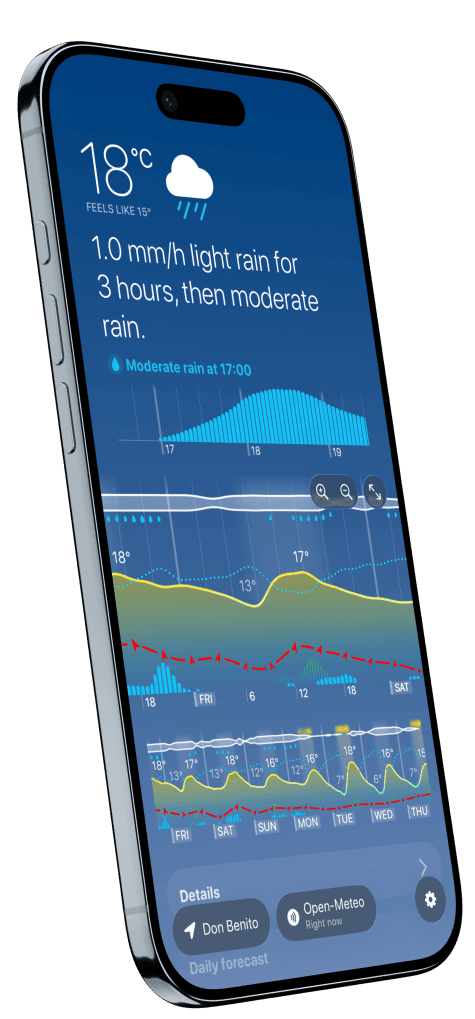
There is no universal legend — bars mean different things in different apps, which is why a general rule is less useful than a specific one. Here is how Weathergraph draws an hourly graph, layer by layer:
- Yellow curve — temperature. The area beneath it is shaded warmer or cooler with the value, so hot and cold stretches are visible before you read a number.
- Blue or white bars — forecast precipitation amount for that hour. Taller bars mean heavier rain or snow.
- Light-blue area behind the bars — precipitation probability, 0–100%. This is a different question from amount, and the two regularly disagree.
- Red dashed line with small arrows — wind speed and direction. Double arrows mark expected gusts.
- Cloud strip along the top — cloud cover, with a yellow glow over daylight hours that are clear or mostly clear, so genuinely sunny periods stand out from merely bright ones.
- Press and hold anywhere on the graph to pin a tooltip with the exact values for that hour, including wind described on the Beaufort scale.
The main chart covers about a day and a half and scrolls sideways for the rest. Above it, a separate minute-by-minute bar graph covers the next three hours, which is the part that answers "do I have twenty minutes before this starts".
The quick method
- Find the time window for your decision. Are you choosing when to walk the dog, leave for work, start a run, photograph a sunset, or cover plants overnight?
- Follow the main trend. Notice whether temperature, rain, or wind is rising, falling, arriving, or clearing.
- Add one supporting layer. Rain probability helps qualify rain amount; gusts add context to average wind; dew point changes how a warm hour may feel.
- Choose a window, not a perfect hour. Forecasts describe a changing atmosphere, so a robust two-hour window is often more useful than treating one timestamp as a promise.
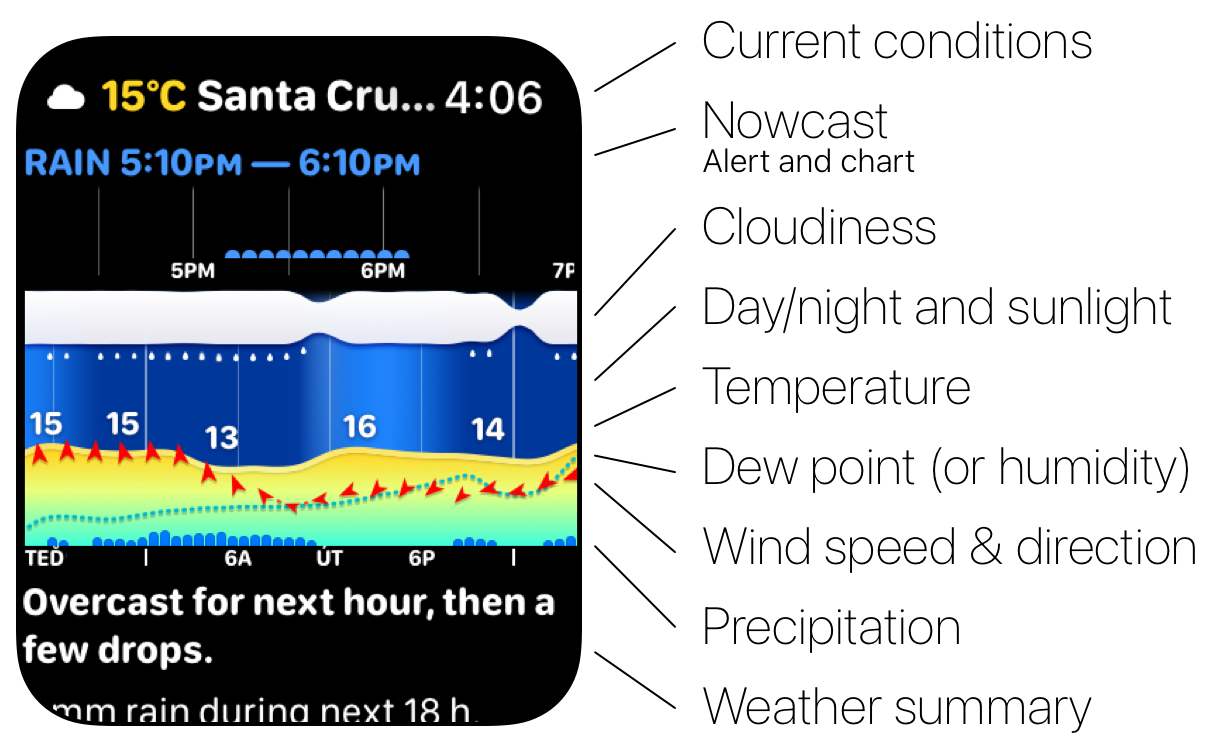
Weathergraph uses a shared visual language across the app, widgets, and Apple Watch. Your graph may show fewer layers because it is configurable.
Read each layer as a question
The same layers again, this time as the question each one answers. These are Weathergraph's layers; another app may use the same shapes for different variables.
| Weathergraph layer | What it represents | The useful question |
|---|---|---|
| Horizontal position | Time, from earlier to later | When does the change reach me? |
| Day/night background and sun glow | Darkness, daylight, and especially sunny periods | Will this happen in daylight, shade, or strong sun? |
| Cloud layer | Expected cloud cover | Is a brighter or clearer interval opening up? |
| Temperature curve | Actual or “feels like” temperature, according to your setting | Is it warming, cooling, crossing freezing, or staying steady? |
| Blue or white precipitation bars | Forecast rain or snow amount | When does precipitation become meaningful, and how intense is it expected to be? |
| Light-blue precipitation area | Probability from 0–100% | How confident is the forecast that measurable precipitation reaches this location? |
| Wind shape and arrows | Wind speed, direction, and gusts | When will wind become inconvenient or important to the activity? |
| Blue dotted line | Humidity or dew point | Will a warm period also become more humid or muggy? |
The layers are not independent. A warm hour in full sun with a high dew point can feel different from the same temperature in cloud and breeze. A small rain amount with high probability suggests a different plan from a larger possible amount with low probability.
Rain probability is not rain amount
A 70% chance of rain does not mean rain for 70% of the hour, nor does it tell you how hard it will rain. The US National Weather Service defines probability of precipitation as the chance that measurable precipitation will occur at a particular location during a specified period. See the NWS definition.
That is why a useful graph shows probability and amount separately:
- Probability asks whether precipitation is likely to reach you.
- Amount describes the precipitation total forecast for the stated interval; its exact interpretation depends on the source.
- Timing asks when the bars begin, peak, and end.
Read all three before deciding whether you need an umbrella, a waterproof layer, a different route, or simply a later departure.
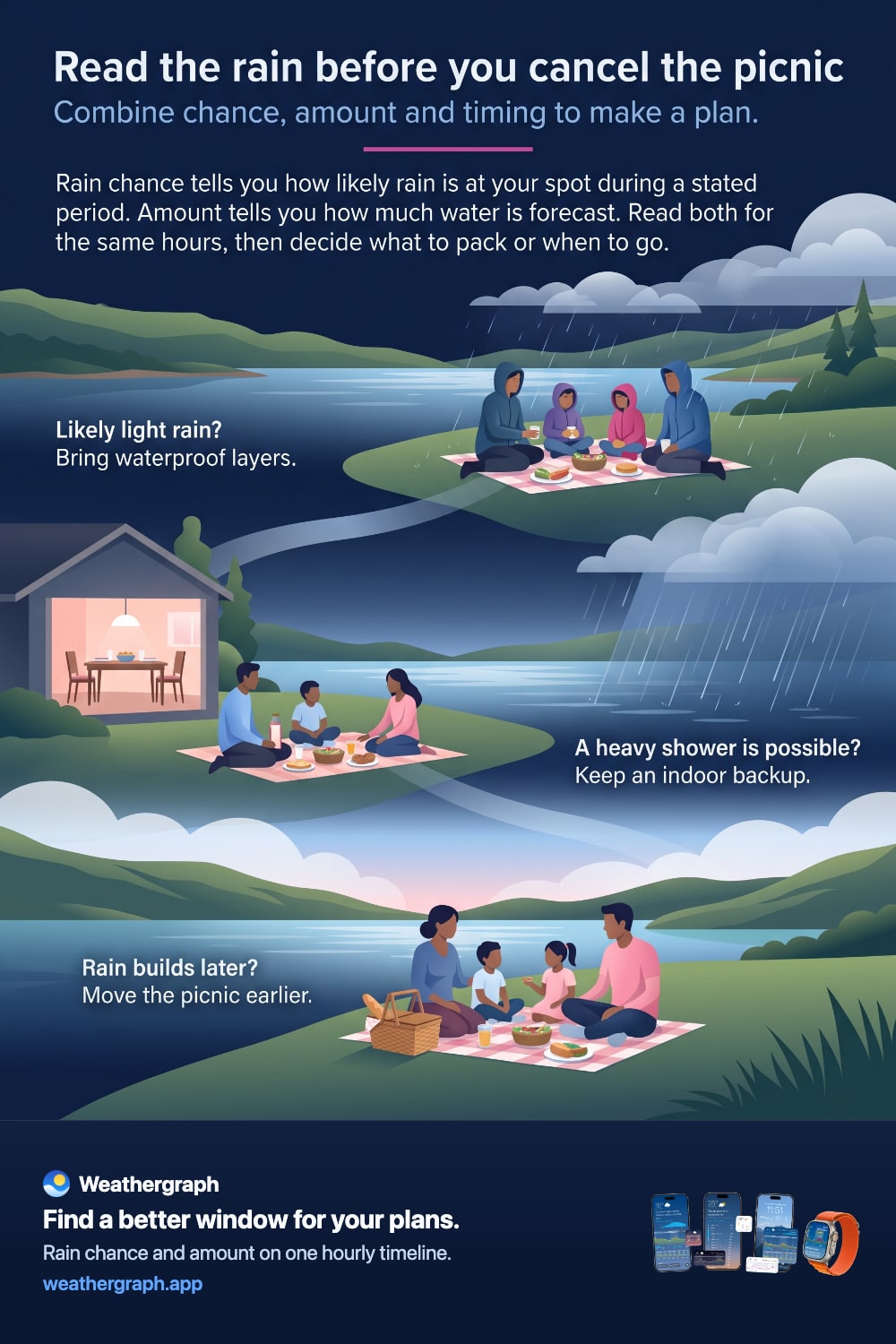
Plan the picnic with chance, amount and timing
When someone says “the forecast has rain, let's cancel,” ask three questions: How likely? How much? Which hours? Read the chance and amount for the same location and forecast interval.
Rain probability estimates how likely measurable precipitation is to occur at your spot during that interval. The amount estimates how much water is forecast. A high chance can accompany a small amount: confidence that rain will happen says little about how much it will disrupt your plans. Conversely, a smaller chance deserves attention when the forecast includes a substantial shower. Amount conventions vary by provider; do not multiply the displayed amount by the probability or assume it is a guaranteed amount if rain occurs.
Here are three illustrative ways a family might use those readings:
| Forecast pattern | What you can explain | A practical response |
|---|---|---|
| Rain looks likely, with only a small amount forecast | Rain may arrive without a large total; check the hourly pattern for concentrated bursts. | Pack waterproof layers and decide whether light rain fits your picnic. |
| A heavy shower is possible, even with a lower chance | Lower probability still leaves a possibility worth planning for. | Keep a nearby indoor alternative rather than relying on the shower missing you. |
| Amounts build after your planned start | The useful question is when the wetter interval arrives. | Move the picnic earlier, including enough time to pack up and return. |
The skill is to connect likelihood to preparation, amount to potential disruption, and timing to your schedule. These are planning examples, not a safety score or a promise of dry weather. Recheck nearer departure. NWS forecast definitions explain probability; its hourly graph guide shows how to examine selected hours and weather elements together.
Weathergraph puts rain chance and amount on one hourly timeline when the selected source supplies them. Read across your whole visit; treat an unavailable layer as missing information, not zero.
For a lake outing, keep water conditions and local restrictions separate. If thunder is heard, the NWS advises moving to a substantial building or enclosed metal-topped vehicle; a picnic shelter is not suitable lightning shelter.
The same time-window habit works for a station walk at arrival, a tennis booking or a stargazing interval.
Why the graph can change
Every point to the right of “now” is a forecast, not a measurement of the future. New observations and new model runs can shift the timing, amount, or shape of a trend. The farther ahead you look, the more useful it is to read the broad pattern rather than fixate on a precise minute.
If two apps show different curves, the reason may be their forecast source, model cycle, processing, or presentation—not necessarily a broken graph. See why weather forecasts disagree for a practical comparison method.
How Weathergraph is designed to be read
Weathergraph can display up to seven days on a continuous hourly timeline. You choose which weather metrics deserve space, whether the temperature curve represents actual or “feels like” conditions, and how much time the chart shows. The aim is not maximum data for its own sake; it is keeping the relationships you care about visible in one glance.
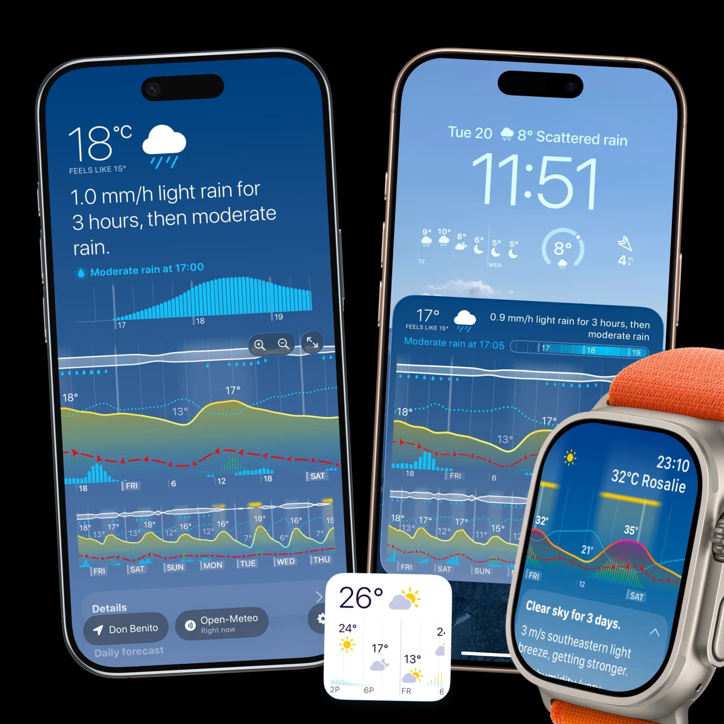
The same chart language carries into Weathergraph widgets and Apple Watch complications, although smaller spaces necessarily show less detail. If the graph ever appears inconsistent with the forecast text or another Weathergraph surface, treat that as something to investigate—not something an explainer should wave away—and contact support with the location, time, source, and a screenshot.
Sources and limits
- The National Weather Service precipitation-probability definition distinguishes the chance of measurable precipitation from its duration or amount.
- Weathergraph's layer descriptions and settings are documented in the Weathergraph FAQ.
- A weather graph helps compare forecast conditions. It does not replace local warnings, observations, or professional guidance for weather-sensitive or safety-critical decisions.
Weathergraph
Turn a forecast into a timing decision
Weathergraph keeps temperature, rain, wind, sunshine, clouds, and the metrics you choose on one hourly timeline—so you can spot a useful window without opening a stack of separate charts.
